Wednesday 4 June 2014

Continuing my Experiments

Continuing with the theme of experimental photography, I decided I would venture into the area of HDR (High Dynamic Range).

I decided to try and avoid the more common type of HDR images where they seem to be over saturated and slightly unnatural. That's not to say they don't look great, they do, but I wanted to try and maintain a more traditional (normal) photographic appearance but with a bit more depth.

The weather wasn't to great on Sunday, so armed with my camera and tripod, my wife and I went out for a Sunday afternoon drive to one of the many old churches in the area.

I decided to photograph the inside of an old church for several reasons.

1. It was dry.........

2. Old Churches tend to have a lot of ornate decoration which could prove to be            
    great subject matter.

3. There is a lot of contrasting light, there would be the bright light from     
    outside streaming through the old windows and there would be a lot of dark    
    areas inside the church, which would enable a large dynamic range, too  
    much for the camera to cope with in a single shot.

Instead of using the bracketing function on my camera, which only allows for 3 shots to be taken at a set exposure +/- 1, 2 or 3 stops, I decided I would take 5 manual exposures. One exposure at the nominal setting, then a further 2, either side of nominal, 1 stop apart, thus ending up with 5 exposures for each image.

Once I had returned home, I downloaded the images from the camera onto my pc and loaded each image into Photoshop Raw one at a time to ensure that I was happy with the white balance, vibrance, clarity and contrast.

Once this was confirmed as acceptable I then converted them into jpeg's for loading into photomatrix to create my HDR images.

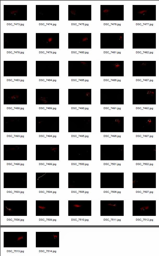
Below is the contact sheet for all the images I used for the HDR's I created.


As you can see from the image above, I took a series of 40 images, 5 for each subject.

Once the HDR image was created, I then loaded each image back into photoshop, as I wanted to finalise each image using Nik Color Efx Pro and Silver Efx Pro.

The reason for this was to ensure that I had control over each image and as I said earlier I didn't want to over process the images.


Above, is one of the images I converted from colour to Black and White using Nik Silver Efx Pro. Hopefully you can see that the dynamic range is higher than what would normally be seen in a standard photograph.


The image above is entitled "The Book" and as I hope you can see, the colours and dynamic range are again greater than would normally be.


This one is called the Angel, for obvious reasons.......

Again dynamic range greater than normal....

So to sum up, I think there is certainly a place for HDR photography, both over saturated and just with a higher dynamic range......

Like with every other type of photography, it's subjective.......

People will make up their own mind.......

Tuesday 20 May 2014

Photo Book Final Evaluation


Photo book project final evaluation

Having completed the first part of the course, Exploring Experimental Photography, I had decided to challenge myself and try something a little different, move away from my comfort zone, for the second part of the course.

To this end, my chosen experimental photography theme for my photo book was going to be painting with light.

The main reason for my choice of subject was that although I love long exposure photography, but this was normally conducted during the daylight hours. I normally photograph landscapes or seascapes which tended to be daylight subjects, so taking photographs during the night was again a different dimension to the normal photography I practice.

That’s not to say I have never tried painting with light, but rather I have never tried it for a prolonged period, or try to improve my technique, so I felt that this would push my knowledge and experience and help me improve.

It also meant that I would then be able to challenge myself and to place myself in different arenas such as the studio and outside in the night time.

Furthermore, the fact that I had to produce a book containing my images meant that I not only had to plan the book format but also plan what images I had to produce. This was to ensure that when the photo book was completed, not only did is serve as a submission piece for the final part of the course, but something that I could show other people and it become a point of discussion.

Quality of images and content were therefore extremely important on several fronts. I wanted to be proud of what I had produced, as I had never produced a book before.

Unlike printing and mounting images, which I do quite regularly when I take a photograph that I like, producing a photo book needs quite some consideration.

Understanding the best layout for the images that I have taken was important, but researching other photo books by famous photographers would also help me understand what the best layout would be.

Probably one of the most famous photo books that I reviewed was “The Americans” by Robert Frank and the layout of the book was simple but effective.

The layout, displaying a single image per double page was clean and simple, but it also meant that you looked at one image at a time. This helps you digest what you are viewing, rather than several images on a single page, which doesn’t help yours eyes rest and take in what you see.

This I believe was extremely important for my book, as the chosen subject was light painting and I wanted the viewer to study each photograph as a single entity and provoke questions such as how did you do that? What did you use to do that? Etc.

When you produce a single image for printing, it’s simply just that, a single image. When you produce a panel of printed images, there are different considerations, such as continuity of subject, colour (are they all uniform), do you have bookend pieces to force the eye from row to row? These are all different considerations to that of producing a book.

The typeface you use when completing the text for the book needs to have some relationship to the theme of the book or a particular image, this helps provide the continuity.

The physical size of the book also needs to be considered, to large and people won’t want to hold it, to small and you won’t be able to present the images effectively.

There are many facets to the photo book project, which, like a jigsaw puzzle have to be placed in the correct order and orientation to compete the final picture.

I have thoroughly enjoyed producing the photo book as I have now become the proud owner of a published piece of work, with my name on the front cover……..

Had I not enrolled on this course, I wouldn’t have even considered producing a photo book. I am now considering producing a second photo book containing some of my better daylight, long exposure landscape and Seascape photography.

 Hopefully, individuals will get the same amount of pleasure viewing my photo book, as I had producing it.

Thursday 15 May 2014

The Book...

It's done....

My book has been submitted for printing and has been returned.

I must say, I am happy with it.

You can view it here, just click on the link below the picture.


Wednesday 14 May 2014

"Light" weight Racer.

After the watch shoot, it was time to try something different......

My son has a Ferrari.....

ok, he's almost fifteen and the Ferrari is a 250mm metal scale model, that came with his aftershave.........

Nevertheless, I thought that it would make a good subject to light paint.


I took 42 separate images for this light painting experiment. 

I wanted to systematically paint the car to produce an image that would hopefully make it into the photobook.

I set the camera up in the usual way, but this time chose, 5 second exposures.

I then proceeded to paint the table and the car in a clockwise motion. I tried to paint a panel of the car at a time, so that the light would be uniform.

Below is the final image.


I must confess, I am very happy with the final result. This image will definitely make it into the photobook. 

I love the highlights created by the torch on the paintwork, as well as the slight shadows on the bonnet and roof.

There are light glints on the chrome and there is just enough light shed into the interior of the car for you to see the seats.

I do have some criticism of the image however, it's not faultless by any means.

I would prefer a larger depth of field and the rear wheel is a little soft, as well as the rear bumper.

I should have probably chosen a better base for the image as well, as the brown fleece is probably not the ideal material to tie in with a car theme.

We live and learn.........


Dark Times......

I wanted to try and photograph a watch using light painting.

I hadn't tried it previously, so decided to give it a go.

Experiment........

Because a watch is a relatively a small item, I decided to use an even smaller torch to try and light the scene.

I have a single AAA (triple A) size torch that is basically a key ring size torch to light the watch.

I also used a much shorter shutter speed of 3 seconds, as I didn't want to light the watch all in one go.


I only took three images, as it quickly became apparent that photographing my watch wasn't going to be easy.

When I say it wasn't going to be easy, what I really mean was I could really make a success of it......


It's an ok image, but it didn't really turn out like I thought it would.


More practice is certainly required for smaller items, I haven't mastered this yet.

I think the stainless steel bezel and bracelet is fairly close to the colour of the actual item, but the watch itself wasn't as sharp as I wanted.

I would prefer that the whole bezel was sharp, instead of only half of the watch face.

Also, there was too much light being cast over the entire watch when I was lighting up parts of it, so a re-think on how I light the watch needs to occur.

I used a 40mm macro lens to take the images, maybe this was the wrong lens, and a re-think on how best to frame the watch and with what equipment needs to take place.

Not for the book, this image I am afraid....

Ain't experimenting fun!!!!!


A "Light" Bouquet

Well,

Back to the studio this week. In my previous post,(compiling my photobook) I said that I was almost ready to submit my photobook for printing.

I thought that maybe a couple of images could be replaced, as some were similar and some could have been improved.

I decided to return to the college studio and light paint some flowers.


I took a series 15 images (see above contact sheet) and combined them in Photoshop.

The usual tools for my work were present, a small "Maglight" type torch (2 x AA size), my D7000, 18-200mm lens, wired remote and tripod. My wife's brown fleece for the table cover, vase and of course the flowers, as the extra props.

I decided to use an aperture of f/13 for these images, with a shutter speed of 8 seconds for each shot.

My usual ISO setting of 100 was used for the image quality.

I choses 8 seconds for the shutter speed after a few trial shots at 4 and 6 seconds. The reason for 8 was that at 8 seconds, it allowed me to be not to bright at the foreground and not so dark when lighting the background that it didn't show up.

For anyone trying to light paint and produce these types of image, don't be afraid to experiment. There is no hard and fast rule. 

Just see what works best for you, the amount of light already available (is the room completely dark) and the brightness of the torch will all make a difference to the shots you take.

Here is the completed image.


I used the screen mode for this image, I usually use "lighten" but this is an experimental Photography course, so why not try something different?

I love the way that painting by light and stacking the images brings out the colours of the subject.

I think by having a black background, it makes the colours more vivid.

Painting by light seems to turn a mundane or flat image into something that has a lot more punch.

I do think however that the image could be improved further by having a little more light on the left hand side of the bouquet, just under the purple flower.

As ever, images usually can be improved to some degree.

I think I have one for the book though!!!!


Monday 5 May 2014

Practice makes Perfect!!!!!

Ok,

They say that practice makes perfect, and I believe that's certainly true with photography.

As well as the light painting, I love to do long exposures, as I have previously stated.

Not a bad morning yesterday (Sunday 4th May) so I decided to pop out to Clydach Gorge, about 10 minutes drive away to try out my new little stopper.....

Lee brought out the "Little Stopper" a couple of months ago and I have used it previously, but practice makes perfect.

Armed with my tripod and camera bag I ventured along the gorge path to one of the waterfall areas.

After taking a couple of shots from the easy point of view I wanted to get some shots from the opposite bank.

To achieve this, it was off with my shoes and socks and wade across the river.... Good job I had my shorts on!!!!!

Below is the contact sheets of the shots I took.

I took a total of 59 shots and finally settled on 6 of them as my favourites.


The first image I decided I like was DSC 7385. This one was taken from the nearside and at a higher level.


Although I do have some foreground interest, the falls are side on and not shown at their best.

 
The shot above is my preferred shot, I love the rock as foreground interest whilst the waterfall in the background is shown off at it's best. My opinion of course.....


The one above is probably my next favourite, however, I do think that the right hand water fall is a little blown out. There is good foreground interest as well as good detail in the water.


Another nice shot is this one with the next waterfall in the foreground, good mid ground detail with the falls in the background, again, maybe the right hand waterfall doesn't have enough detail.


This one is taken from a different angle and has a different boulder in the foreground, I quite like this one, as the boulder has good detail. However, I do think that the pale rocks in the immediate foreground are a little distracting.
 
 
This one has a less messy foreground as it is taken with a different focal length from the image above. The thing that spoils it for me is the plume of spray around the fall, I feel it lacks detail.
 
All in all though not a bad set of images in my opinion, good detail in the river water and the left hand waterfall has good detail.
 
There wasn't much colour cast from the "little Stopper", a six stop filter, so not much adjustment to the colour was needed. The greens of the rocks were this vivid and lush.
 
 
I have definitely improved my photography since the last time I took an image from here (below).....
 
So although they're not perfect, practice certainly ensure improvement.
 
 
Below is one of my first attempts at Clydach falls.


I think my photography has improved quite a bit........