Thursday, 30 January 2014

Lets give it a go !!!

Inspired by Eric William Curry's photographs, it was time to give it a go.

My Photoshop skills with layers are not anywhere as good as Eric Curry's, so for a first off attempt I decided it was a "lets just take a single shot of a particular scene and see what happens".


The above image was taken at a local children's  play area.

The idea was to set the camera on long exposure in darkness and light the scene with a torch.

This shot was a pre-cursor to the main trials, just to get a feel of what was required to produce a good shot.

Camera settings were ~ Shutter Speed of 30 seconds, an Aperture of f3.5, ISO set at 100 and a focal length of 30mm

I actually like this shot, it is well lit and quite sharp.

What I dislike about the image is that it is quite bright on the white board, probably a bit to bright and toning down of this area would be more preferable.

Attempt two......

This time I decided to try for a more technically challenging scene. A scene with more than one element and hopefully a chance to get a better composition.

Blaenavon has a local railway that's open for visitors on the weekends for steam train trips.

I decided to go to the train station and try to illuminate it at night with the tracks illuminated as well to produce a more compositionally pleasing image.

I took a number of images and then chose what I felt was the best one.

Below is the contact sheet for the images taken.

 
I decided that image DSC _1891 was the best one and converted it into a JPEG.
 
 
The final image can be seen below.


I think that compositionally this image works, it is well lit and bright.

The image was taken at F5.6 for 30 seconds at an ISO of 200. The lens used was a Tokina 11-16mm wide angle lens @ 16mm.

I personally think that the colours have been re-produced well with the correct white balance.

Can the image be improved?

Well the answer is yes, I think that I could have used a smaller aperture to bring more of the image in focus. Probably used a f stop of about f/11. I also think that including less sky would have helped.

I have decided that working with light may be the theme for my photo book, I have started reviewing other photographers that work or paint with light and I have many more ideas on what to do with both light and subject matter.

Painting with light

This is a subject that I am very interested in.

I love the idea of viewing a scene in a "different light" as it were.

I also like the idea of creating an image from scratch. By this I mean generating an image using light that would not be normally viewed if taken in the daylight.

I have researched an number of individuals that use light to create a scene, and tried to take some of their ideas or processes and integrate them into my photography.

Eric William Curry

Eric was born in Los Angeles in 1956 and originally specialised in studio still life photography.

The image below was taken at night using various lighting techniques including a torch.
 
Eric takes a photograph of a scene with a certain section lit, he then takes another photograph of the same scene with another section lit. Finally he combines all the images as layers in Photoshop to obtain the final image above.

I think this photo is fantastic and it shows a real labour of love and dedication, to light the entire area with torch.

Painting with light really makes the image come alive, the colours are more vibrant and the detail is much more visible, when compared to the same image shot in daylight, shown below.

 
When you compare the two images above, you can be forgiven if you think that initially they are of two different scenes. The daylight photograph is dull and lifeless with only minimal detail that can be lost when viewing the image.
 
The lit photograph however is completely different, there is detail and reflection in the body of the caravan as well as details inside, as the inside of the van has been illuminated at night.
 

Included below is a video tutorial from Eric himself on how he put this image together.


Another image of Eric's that I like is of the plane in a hanger.
 
 
I like this image for a number of reasons.
The lighting of the plane is exceptional.
The shadows created by using a torch add to the image, which you wouldn't be able to achieve in normal daylight.
The shadows and highlights created on the man closing the door, again are that much more pronounced by using torch light and capturing the image in the night rather than the day.
I believe there is much more detail in this photograph because it was produced by the torchlight method.


More of Eric's work can be found on his website, "American Pride and Passion" just follow the link http://www.americanprideandpassion.com/photographs.php

I have used some of Eric's work as inspiration for my own painting with light project.

Matt Murtagh, A Modern Day Joiner.....


Whilst researching the photo joiner technique I came across another professional photographer that is UK based and practices photo joiners as part of his work.

His name is Matt Murtagh and he has a professional website detailing some of his work. Matt is from and Based in Birmingham and does studio, wedding and location photography.

His website can be found here http://www.mattmurtaghphotography.com/ and the images that I have included here in my blog are attributed to Matt and obviously are his copyrighted material.

Matt also has a wedding photography web site and Flickr page.

St Martins, Birmingham
 
The first image that I have chosen of Matt’s is entitled “St Martins”.
This joiner is of St Martins Church in the Bull ring in Birmingham. I like the symmetry to this image, although not exactly the same, you have the two “book end” buildings on the left and right with the main focal point dead centre.
The joiner is well constructed and has plenty of detail to look at, whilst being simplistic enough, not to be confusing.
If I were taking the joiner, I may have tried to move a little to the left or a little more forward to exclude the monument on the far right as this can be a little distracting.
St Martins taken from above

Trafalgar Square

Another image of Matt’s that took my eye was of Trafalgar square.
This image is great, as there is a huge amount of activity in the foreground with people moving about and getting on with their daily activities.
Because of the time lapse nature of joiners, the people themselves are disjointed and for me that adds interest.
It is also a photograph that has been taken in the wet and the reflections.


This image has been well thought out and constructed.

This is an image which I would have loved to have taken and would not change anything with this image. It has plenty of detail and impact and I have to admit to being more intrigued by photo joiners the more research I do into the subject.

Trafalgar Square


Sunday, 26 January 2014

A Pool with a view

The Keepers Pond

Spurred on by my first attempt of a photo Joiner, I decided to have a go at a larger scene.

My chosen subject was to be the "Keepers Pond" and the distant "Sugar Loaf" mountain as viewed from above my house on the top of the Blorenge mountain.

The keepers pond is so also reffered to as Pen-ffordd-goch Pond or the Forge Pond. The pond is also situated near Pwll Du. The pond was built in the early 19th century to provide a water supply for the now closed and knocked down Garnddyrys Forge, which produced iron from around 1817 to about 1860.

Although the pond is no longer required, it has become a local beauty spot.The name Keeper’s Pond comes from the gamekeeper of the grouse moors who lived in a cottage nearby.

The Process

I took a series of 54 images in total to build my photo joiners scene, although I only used forty in the final image.

All the images can be seen in the contact sheets below.

Once I had loaded all the images onto my new page, I started to arrange them to make an image. I set the camera to auto WB but left the aperture on manual, as I wanted to have varying degrees of light and dark images to add to the composition.
I used a total of 40 photographs to make up the final image, not requiring about 15.
The 15 surplus images were images that were either duplicates of part of the scene or images that were to close to the other images used to be of any use.

The Final Image

 
I am quite pleased with the overall effect that has been produced.
 
The final image has depth of field and a subject matter that can be identified. I have tried to introduce an image that is a little disjointed, i.e. not all the individual photos line up, but are not to disjointed to interfere with the overall look or flow of the image.
 
When taking the individual photographs that make up the image I did try and take then from different view points, again to try and introduce images with a different perspective, I think this also works well.
 
Can the image be improved upon? I think so, maybe having the foreground lighter would help, as well has having a human element in would also add another dimension to the image.
 
 
More practice with this type of genre is required to perfect, but with this being my second attempt I am happy.

Further David Hockney reviews

Yosemite

Another image of David's that I like is entitled Yosemite.

I think this image is quite contemporary, and it certainly, as with other of David's demonstrates a different approach to photography.

I have grown to like this idea more and more as I have looked at different images of David's and capturing different sections of a scene in each photography, so that they can be assembled into a larger image is a great idea.

It adds interest and variety to the image, as each photograph is subtly different.

For example, each shot of the sky is exposed differently adding interest to the image, The limiting factor for me is Size........

They wouldn't fit in my house........


Mother
 
Another image of David's that I find intriguing is the joiner of his mother sat in a chair in her living room in Bradford.
 
This image is made up of 112 separate borderless polaroid images, placed together to make a contemporary image of his mother.
 
The colours are great, and I particularly like the fact that not all the images meet perfectly. For instance, her face and hands don't line up correctly. This may not be intentional but it adds interest to the image.
 
It's not the sort of photography that interest me enough to move from the Landscape's that I enjoy, but it is interesting and it certainly reflects his style of painting and the cubism style which you associate with Picasso.


David Hockney's Pearblossom Highway

David Hockneys Pearlblossom Highway.

Whilst researching information for David Hockney's pearlblossom highway I came across this video on You Tube from Getty Images.

David reply's to a number of questions about his artwork which I found very interesting.

I used this as a base for some of my research.

Enjoy.


Saturday, 25 January 2014

Lets try it

After reviewing David Hockney's photo joiners, it was time for my first attempt.

I decided to start off with a simple subject, as I thought this might aid my re-assembling of the photos into something recognisable.

I took a series of photographs of my front garden. Forty Two photographs in total (42) and re-assembled them on a digital page.

I decided that I only needed Twenty Eight of the Forty Two to completed the composition.

I loaded them into photoshop as layers and changed the size of the photos to be more manageable.

Once they images were reduced in size, I then copied them onto another new page in photoshop.

These images were then moved around until I was comfortable and happy with the composition.

Any images layers I felt did not add to the image I then turned off (made invisible)

The image was then flattened and saved as a JPEG.

The Bird Bath


The image is entitled "The Bird Bath", for obvious reasons !!!!
 
 
I think for the first attempt the image works well. The subject matter is identifiable, and the composition works well.
 
 
I feel that there is a continuity to the image allowing the eye to flow through the scene, although I feel the image hasn't lost any of its "joiner" characteristics.
 
 
Contact Sheet
 

Above is a contact sheet view of the 42 initial images used to make up the final composition.


Saturday, 18 January 2014

David Hockney and Photo Joiners


David Hockney is a renowned Artist and Photographer.
He was born in Bradford, England, on 9 July 1937. His parents were Laura Beth and Kenneth Hockney, and the fourth of five children.
He was educated at Wellington Primary School, Bradford Grammar School, Bradford College of Art and the Royal College of Art in London, whilst at the Royal College of Art; Hockney featured in an exhibition entitled “Young Contemporaries which also included Peter Blake.
When the Royal College of Art refused to let him graduate 1962 because he believed he should be assessed on his art work, not an essay, Hockney drew the sketch The Diploma in protest.
The Diploma
 
By this time, Hockney had a growing reputation and recognising that he had talent; the Royal College of Art amended their regulations and awarded him the Diploma.
 
Hockney started to produce photo collages in the early 1980's. He called these collages "Joiners". 
His initial venture into this medium started with a polaroid camera and he then moved onto 35mm film, which he had produced commercially.
 
David chose a subject and took individual photographs at slightly different angles and times, he then assembled these photographs on a board.
 
These images had some resemblance to cubism, and artists such as Pablo Picasso.
 
Pictured here is David Hockney's Mother, one of his first, you can see the resemblance in style to Picasso's image.
 
David Hockney's Mother
 
Picassos "Girl with a Mandolin"
 
 
Another famous image of Hockney's is Pearlblossom Highway (below), originally designed to tell a story for Vanity Fair, it is made up of about 800 images.


The sky is made up of about 200 on its own. David compiled these images over about 10 days, taking the photographs from different angels, to try and draw the viewer into the image.
 
He stood on a set of steps to photograph the signs from straight on and in the original image you can see the paint cracking.
 
David believes that the image became much too big as he ran away with the idea. Vanity Fair never used the image, but he never minded as he believes he got something out of it.
 
I actually quite like the image as a piece of art. I wouldn't call it a photograph; I would call it a painting or drawing.
 
For me, a photograph is a single image of a particular view or item. Yes, a photograph can be manipulated, colours changed, sharpened or whatever, but at its most basic, it's a single image, a reproduction of the original.
 
When you start to create a picture, for me, it becomes an image.
 
David has created an image by taking many photographs of individual items from the original location and recreated the scene. This scene then becomes a representation of the original and not a reproduction.
 
I'm sure many would argue the point, but it is only my opinion.
 
Whatever you wish to call Pearlblossom Highway, whether it be a photograph, painting or drawing, maybe all three, it certainly is an intriguing piece of art.
 
I am looking forward to recreating a scene in this way. It's something I haven't tried before and maybe it will be something I like. I did state in a previous comment that I thought it wouldn't be my preferred choice for the photo book project, but let's just wait and see..........


Uh Oh......

Well, Wednesday arrived and it was time to go to college.

Dave had some bad news, well, I say bad news, it wasn't really bad news it was just news that I wasn't expecting.

The Photo Book project was being moved to the second half of the course and the theme of the Photo Book was being changed from a theme of our choice, as in any subject, to a theme which should incorporate a particular type or method of photography.

That's different I thought.....

Dave explained that we would be reviewing and trying different styles of photography in the coming weeks and whatever we preferred out of these various types or styles, we could use to generate a Photo Book.

That sounds really interesting.....

Pin hole photography, working with light in the dark and Photo Joiners were going to be some of the styles reviewed and worked with over the coming weeks.

We watched a video of an Artist/Photographer called David Hockney.

I had heard of David previously, as I discovered him during the BTEC Level 2 course in 2012.

Not really my cup of tea to be honest.... So I moved onto other photographers for my research....

That was then, this is now......

After watching the video, I thought, do you know what? I think I should at least try it..... It won't be my preferred choice I don't think, but it will be interesting trying....

Painting with light has always interested me and I had chosen this as one of my subject matters last time.

Pin hole photography is another genre that I haven't tried previously, so again something new....

All in all, an interesting next few weeks.......

Decisions

Well,

I had Finally made my mind up.......

My Photo Book was going to consist of some of my Landscape work....

I had decided to stick with and improve my Landscape photography..... I had just upgraded to my new 105mm Circular polariser and was looking forward to trying it out with my Lee filter holder.


It would also allow me to continue improving my long exposure work.


Both these images were taken using the Hitech Pro 10 Stopper, which I love.


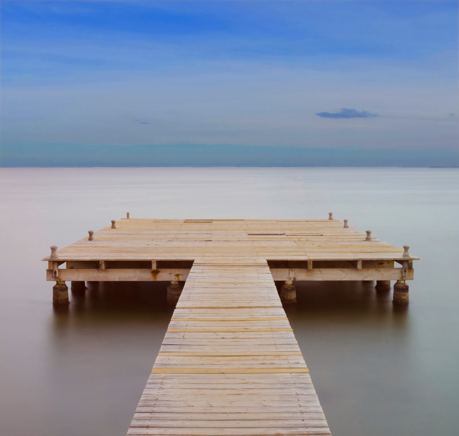
Below are the contact sheets for the pier (entitled Tranquility).


I tried several compositions for the shot, as you can see from the contact sheets, but finally settled on DSC_1263.

I felt this was the best viewing angle and with a change of temperature in the Adobe Raw program (to remove the colour cast from the filter) the image was complete.

Compositionally, I think the shot works well, I also like the simplicity of the shot.

It can be improved however, by choosing a different time of day, maybe a sunrise, or more cloud in the sky would provide more detail.


I am not naive enough to think that these shots or indeed any other photographs I have taken can't be improved on, so more practice would only be a good thing.


Another image that I felt would go well in my Landscape project was one of my images entitled "The Fairy Pools" (below)

 
This one again, was using a big stopper filter, so it fitted with what I wanted to do and of course, in my opinion it was the best image I had out of the collection I had taken.


Image DSC_0349 was definitely the best, it had great colour and I felt the there was a limited amount of burn out in the water fall. I did say limited, I was 100% happy with it, but it was quite good.

There was also some foreground interest with the rocks in the stream as well, so this added to the composition.

I did feel however, that it could still be further improved.

I decided to change from a portrait style format to a square format, tightening in on the waterfall and having the rock closer in the foreground. The result I think improved the image no end, it could still be improved further by having less blown out highlights in the water fall, but never the less, I think by changing the format it improved the image no end.


I ventured out last weekend to the Brecon Beacons (no polariser yet, not arrived), to get more shots "in the bag", as last Saturday (11th Jan) was the only nice day of the weekend.

First stop was Talybont Reservoir...


Unfortunately, it seams that early morning at this time of year, doesn't present the reservoir in the best light and all I had was some highlights on the top of the hill in the distance.

I did manage to get a lovely reflection in the water in the foreground, but  nothing to write home about.....

I then moved on up the valley and stopped off at a waterfall, the sun was very bright now and shining directly onto the water.

"10 Stopper" I thought, only way to shoot this in this bright light.

It was my only chance to get an image, not really the ideal conditions for photography.... The sky was blue, hardly a cloud, not ideal......


We photographers are a hard bunch to please......  Raining or dull day, we complain the light is flat, Blue Skies and no cloud, too bright.

This image was taken at f13 for 30 seconds at a focal length of 24mm.

It didn't turn out too bad; I think the composition works as the water flows through the image quite well. However it is a bit blown out where the actual falls are.... too much loss of detail for my liking another visit with better lighting is planned.

I then move onward and upward to the Upper Neuadd Reservoir. Never been there before, so with Pen y Fan, Corn Du and the Cribyn as backdrop, I proceeded to try and get a compositionally pleasing image of the water with some foreground detail.


With all the rain we have had, apparently the reservoir was extremely full, so getting an image that was compositionally pleasing with foreground detail was going to be a challenge.

Not only that, the sky was bright blue and no cloud detail.

I decided to move my point of view, and try a different composition, there was a cloud on the move, just the one, and I thought at least it would give me some detail in the sky with some shadow.


With a couple more images taken, it was time to move on, I had been out for quite some time and the afternoon had arrived.....

The final shot of the day was taken at Pontsticle reservoir.

Pontsticle Reservoir has a sink hole which has been photographed many times by many people, but not me... So I decided to have a go.

Being surrounded by a wall, compositionally, you are restricted to only a couple of angles. Again, lighting was not ideal as the sky was bright blue and there was a harsh light.

The moon was out though and there was a train puffing away in the background so at least there was other detail to consider.


Time to head home. I had some images on the camera, it was the first day out "togging" for some time so I was quite happy.

At least I had made a start, the images may not make the final Photo Book but I was off and running.

Looking forward to the next course evening, at least I had some images to present and discuss my plans for the photo Book with Dave the tutor.

"Happy Days"


Thursday, 9 January 2014

Day 2.....

OK, Day 2.....

Long day in work and now I have some time to sit down and type a few thoughts about my chosen subject for the Photobook.....

Should I try something new? Studio work maybe..... Not really sure...... what would be the subject?

What about outdoors? Land and sea scapes, now this I like....... What are the advantages? Well living in Wales there is certainly enough water and mountains to satisfy......

There are disadvantages to these subjects though, first is the issue of getting out and about..... long working hours, short days and poor light will all affect the quality of the images......

There is of course still life..... I do have some lights and a light tent, but is this the right equipment? not sure.... not really done much still life either.....

Ok then, Street photography........

Well, I could certainly take some candid and close up shots, and this could be a venture into the unknown.....

Well....

Decisions, Decisions.....

Guess I need to think some more about it.....

I have a week don't I?

Wednesday, 8 January 2014

My first steps into the Blogging world.....

Ok, this is my first entry into this blog. 
The blog's purpose is to detail my endevours to complete my BTEC Level 3 assignment..... 
Wish me Luck!!!! and keep an eye on it's progress...